
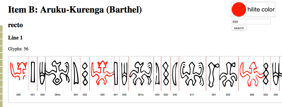
I have added a search feature to the color chooser. Enter a code and click “search”. All glyphs with that code on the page will be colored with the current hilite color. So it works just like clicking on the glyphs, except it’s quicker.
More »
I’m adding a new viewer: a ‘snippet’ collector. This viewer allows the selection of short line snippets which are displayed together on a single page.

More »
- Made corrections to the display of items K, P, and Q verso, and N side b.
- Added a feature to rotate the tablet display 180º.
- Added line numbers and a feature to be able to hide them.
I am adding another form of display. This tries to show the lines as they appear on the tablets, that is “bottom up” and reversed boustrophedon. The display is always as a single tablet side, with little to no space between lines. The purpose is to get a better idea of the general aspect of the tablet.
Please note that I say “try”. The way the lines are displayed is less then perfect, since the line graphics for a single tablet are often of uneven length. One reason for this is of course that the lines are sometimes of very different lengths. But other times this seems to be because the glyphs have been “normalized”, i.e, glyphs which are actually of uneven size are drawn to appear the same size. Because of this, this form of display does not faithfully render glyph adjacency on neighboring lines. The display is auto-generated, and all lines are centered, so in particular short lines can be very far from there correct location.
Considering these problems one might wonder: ‘Why bother?’. Despite the shortcomings I believe that this form of display is helpful. For one it is a reminder of how the lines are arrayed on the tablets. Also for some tablets it actually makes things clearer. This is most obvious with Items that are heavily damaged. For items M and T, Barthel’s graphics show the lines at roughly the same length, with the damaged sections indicated. Placing the lines next to each other gives a general impression of where the legible sections are located on the tablets. This is also the case for item H, where the damaged section covers several lines. On Item D the gash between lines 5 and 6 on side a, which gives the tablet its name (l’Échancrée), becomes clearly visible. Item F’s near circular shape—it is presumably a small shard of an originally larger item—becomes apparent.
A few items (O, V, J, L, X), where I found this form of display to be unhelpful, have been left out.
I have changed the display pages to include “quick navigation” menus. These allow jumping directly to the desired side or line of the tablet.

A feature that I had wanted to add for a long time, is glyph coloring. I have now updated the system for clicking on glyphs to allow for different colors. The display pages now have a “color chooser” in the top right corner. Clicking on this will let you cycle through a set of colors (red, purple, green, blue, and black). The chosen color will then be the clickable color. This makes it possible to hilite various glyphs patterns, similar to the examples on the old rongorongo.org.
For example the “genealogy” on Item G:
Butinov/Knozorov “genealogy” on Item G.
At the current time it is not possible to save such colorings. But perhaps in the future.
A few more improvements and changes:
- I have added a total for the number of glyphs found. This is added after all hits have been loaded, which may take a while. It appears at the top of the list.
- I have added a search capability for sequences of 2 glyphs. Note that this searches for sequences. It doesn’t distinguish whether the glyphs are linked or stacked, or simply adjacent. Also it only searches for glyphs which are immediately adjacent.
- A link was added to the navigation bar called Corpus which links to the new site.

It’s been a while.
After the push to finish the svgs and the (preliminary) index, I felt a bit of burn-out. Hopefully I should be able to continue pick up where I left off soon. This post to show that this website is still alive. Above a screen visualization of the Rongorongo corpus as viewed through a database tool called “BaseX“. Hopefully once I learn to use it I can do something more useful with it.