
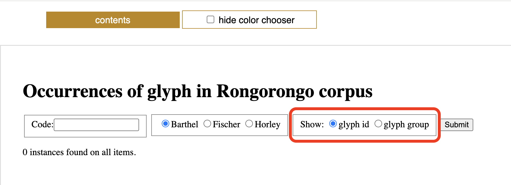
Up until now the glyph index showed all glyphs with the id number used to uniquely identify them in the corpus. I have now added an option to show Horley’s glyph group numbers instead. Below is an example of what results look like when this option is chosen.

Unlike the glyph ids which are 3 digit, zero-padded numbers, the glyph group numbers display as simple numbers with no zero-padding.
At this point I have also completed adding glyph group numbers to all the remaining tablets, from the Berlin Tablet O all the way to the Paris Snuffbox Y. Note that this again means that some tablets have had their side and/or line numbers rearranged
- Item O: Previously lines 1–9 are now lines 2–10.
- Item R: Previous “side b” is now the recto and “side a” the verso. The verso lines 1–8 are now 2–9.
- Item S: Essentially the same as R. Side b is now the recto, and side a lines 1–8 are now verso lines 2–9.
- Item T: The sole legible side is renamed “verso”, and the line order is reversed, so that previous line 11 is now the first line, and continuing 10, 9, … down to 1.
- Item U: The 4 lines from side a are now recto lines 5–2 so also in inverted order. The 1 line from side b which Fischer identified is now verso line 8.
- Item X: The New York Birdman has undergone more radical re-arrangement. See the tablet page for an explanation.
- Item Y: The Paris Snuffbox has also been re-arranged to match the lines and order identified by Horley.
There seem to be overlapping numbers sometimes in the display of the snippet viewer. For example, here:
http://kohaumotu.org/Rongorongo_new/views/lines.php?item=Y&type=h#Yb02
Hello Don,
I assume you are referring to things like this:
http://kohaumotu.org/blog/wp-content/uploads/2026/11/Code_number_overlap.png
This is just an unavoidable fact due to the code numbers being sometimes much wider than the glyphs they are numbering. When that happens you can still select the numbers and copy them out, then paste them in another window.
To completely avoid this I would have to make the font size for the numbers much smaller. The current font size is a compromise between legibility and a good fit.