Having been up and running for about 12 years now, I have undertaken a reorganization of this website. The following changes have been made:

  • The WordPress “blog” has now been made the main site. The static pages have been made the main entry site, while the “blog” itself has been relegated to an Updates page.
  • Relevant information from the old (hand-coded) HTML site has been moved to this site, updated and stream-lined.
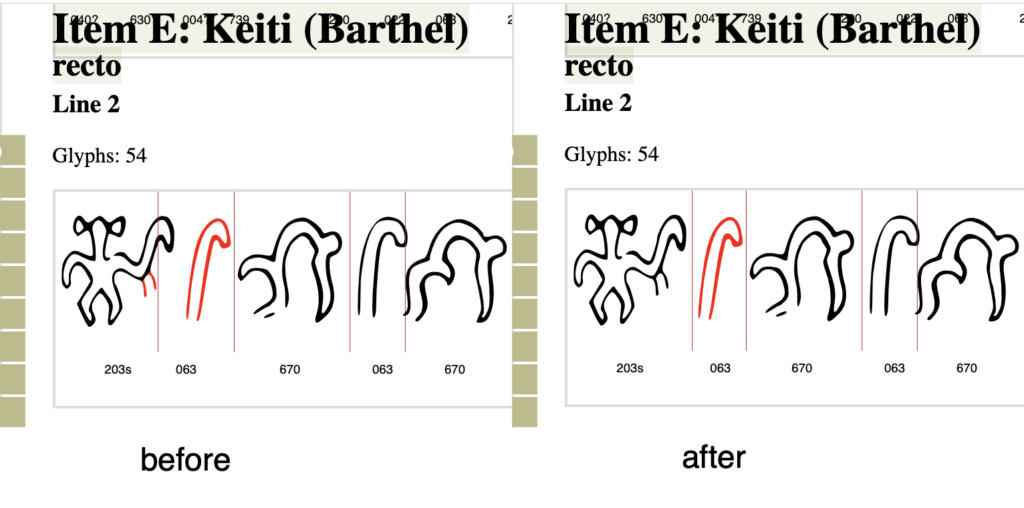
  • The Corpus site, which presents the glyphs from the XML database, can be accessed from the main menu (as before). Pages for all the tablets have been added, and links to the Corpus page for each tablet can be found on those pages, along with other relevant info and links. The welter of old implementations of the corpus (low quality SVGs and PNGs) have been side-lined.

Please enjoy.

I have now thoroughly re-worked the snippet viewer, aka, snippet collector. The following changes were made:

More »

This site may give the impression that it is stale, but there is some work going on behind the scenes. Today I finally got around to improving the navigation on the dictionary, which should make it easier to move around.

Various small changes and other clean-up.

  • Changed the quick navigation menu to display on the side, and stay in the window, so it is always available. Also made it so that it slides in and out to take up less space.
  • Added a button to hide the “hilite color chooser”, since it can get in the way sometimes. Clicking to color glyphs works even if the chooser is hidden. The button is at the top of the page, next to the navigation menu.
  • Fixed the coloring of glyphs. Now it should work in Firefox as well.
  • Various bits of technical clean-up. Hopefully I didn’t break anything. If something used to work and now doesn’t, feel free to leave a comment.
  • Made corrections to the display of items K, P, and Q verso, and N side b.
  • Added a feature to rotate the tablet display 180º.
  • Added line numbers and a feature to be able to hide them.

I have changed the display pages to include “quick navigation” menus. These allow jumping directly to the desired side or line of the tablet.
quick_nav_bar

A few more improvements and changes:

  • I have added a total for the number of glyphs found. This is added after all hits have been loaded, which may take a while. It appears at the top of the list.
  • I have added a search capability for sequences of 2 glyphs. Note that this searches for sequences. It doesn’t distinguish whether the glyphs are linked or stacked, or simply adjacent. Also it only searches for glyphs which are immediately adjacent.
  • A link was added to the navigation bar called Corpus which links to the new site.

More »

I have made a number of improvements to the new pages. The most significant is the addition of a glyph search feature. This feature allows users to enter a Barthel code and view all instances of glyphs with that code, in context. The length of the context can be adjusted as well. The default is 300 (pixels) which usually allows for about 5 or 6 glyphs on each side. This search feature is similar to a feature that was implemented before, but in my testing was always excruciatingly slow. The current implementation should hopefully be quicker. Since the number of glyphs returned can be quite large, I have also added a short navigation menu at the top, which allows jumping to the hits for a given tablet.

The way this feature is now implemented, it is possible to bookmark search results. For instance a search for glyph 306 has the link:
http://kohaumotu.org/Rongorongo_new/views/glyph_search_by_code.php?code=306&type=b&context_width=300.

The Barthel/Fischer comparison pages have also been improved, so that there is less distortion to the Fischer glyphs. Glyph groups should no longer be pulled apart.

This site in its current form has become too hard to manage. So taking advantage of the possibilities offered by more advanced web technologies, I am going to start over.

A first step in this direction is available here.
New site
More »

In response to the issue of better quality images, I have now made a first stab at an improvement. I have now posted a new set of pages which display better scanned and edited versions of the Fischer drawings. The pages can be found here. Note that these pages display the tablets on single pages, with all lines as complete lines, no codes. They are also pretty big, so unless one has a very wide monitor, a lot of horizontal scrolling will be involved, particularly for something like the Staff.

More »